

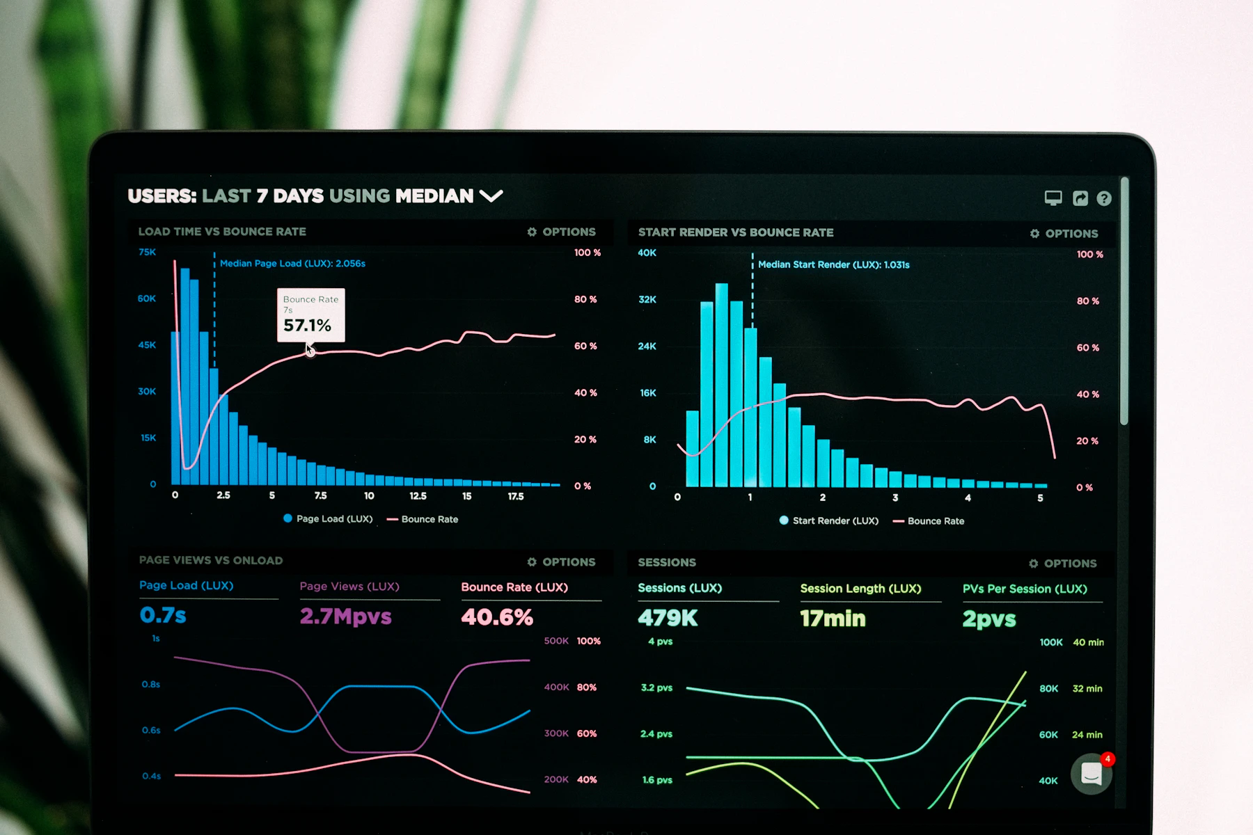
In July we audited our own Grafana — the one we monitor clients' systems through as part of our managed IT work. The result: 47 dashboards across clients. According to the usage stats, six of them had been opened by anyone in the past ninety days. The other forty-one were being looked at by nobody — just dutifully re-rendering into the void every thirty seconds.
This note is about how that happened, what we did about it, and what's left of our monitoring. It follows on from an older piece about what we watch on a managed UniFi network — this is the same question asked one layer up, over servers and applications.
How dashboards multiply
None of those forty-one dashboards was born of stupidity. Almost every one has the same origin: an incident. Something went down, and mid-firefight somebody assembled a panel with exactly the charts that helped that day — then saved it afterwards, 'because it'll come in handy next time'. But next time the incident looks different, so another panel gets built. A dashboard is the minutes of the last fire, not preparation for the next one.
The second source is imports. Node exporter has a community dashboard with thirty-plus panels, Postgres another, Kubernetes whole sets of them. Importing them takes a minute and looks like extra diligence. But thirty charts where you can't say which one matters isn't monitoring — it's wallpaper.
The test we ran all 47 through
We used a single question to clean house: 'If this dashboard vanished tonight, would anyone notice within a month?' If the answer was no, we deleted it. Not archived, not moved to an 'old' folder — deleted; the definitions live in Git anyway. Twelve survived: one overview per client and a handful of service dashboards. In the two months since the cleanup, we haven't missed a single deleted one.
Four numbers instead of forty charts
The real change wasn't the deleting, though — it was admitting that monitoring doesn't rest on dashboards. It rests on alerts. A dashboard only works while someone is looking at it; an alert works while nobody is. Since the audit, every managed client gets four mandatory alerts, all on symptoms rather than causes:
- Error rate on public endpoints — the share of 5xx responses over the past five minutes. Not CPU, not memory: a busy processor doesn't hurt the client, an app that doesn't work does.
- p95 latency — users feel a slowdown long before anything crashes. We don't use the average; the average lies.
- Days until the disk is full — not a percentage. 'The disk is at 82%' says nothing; 'at this rate it's full in nine days' says exactly when to act.
- Age of the last tested backup — not when the backup ran, but when a trial restore from it last succeeded. We wrote about why in the piece on the on-prem backup nobody had tested.
A dashboard nobody opens isn't monitoring. It's a museum of past incidents — and the admission fee is paid in the time of whoever maintains it.
The one dashboard that stayed on the wall
We kept one dashboard per client, and it hangs on the office TV: thirty-day availability, current error rate, the date of the last successful trial restore, and the count of open alerts. Four numbers, no charts, readable from across the room. When everything is green, nobody looks at it — which is exactly the point. The time to look is when one of the numbers speaks up on its own.
If your Grafana looks more like a gallery than like monitoring — or if monitoring currently means 'a client calls to say the site is down' — we're happy to take a look. Setting up those four alerts is the first week of a managed IT engagement, not a quarter-long project.
